
Results
A rare cross-cultural position made visible
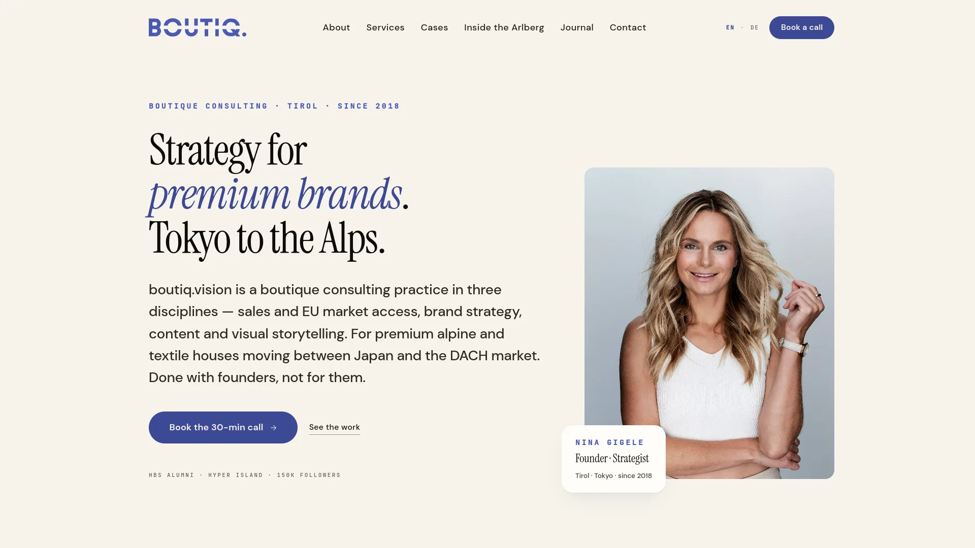
The DACH to Japan niche sits front and center. Premium brands looking for exactly that bridge recognize boutiq.vision as the right partner on the first screen.
One site, two audiences, zero compromise
Full EN/DE parity. Austrian and German clients read German, international luxury brands read English, and neither version feels like a translation.
NDA-safe proof through specificity
Named industries and outcome framing replace logo walls. Clients recognize their own challenge in the narrative without any client relationship being exposed.
Inquiries arrive pre-framed
The contact form asks for the challenge and the preferred language, so Nina starts every conversation already knowing what the client needs.
The Challenge
boutiq.vision is a boutique consulting practice founded in 2018 and run from Tirol: sales strategy, brand positioning and visual storytelling for premium brands moving between the DACH market and Japan.
Premium brand consulting is a trust business - the client is committing significant budget to a single advisor. That created four specific gaps:
- The site had to carry Nina’s personal authority, not just list services.
- The DACH to Japan positioning is rare and valuable, but the previous site surfaced it neither visually nor in the copy.
- One site had to serve a bilingual EN/DE audience with different expectations, without either version feeling secondary.
- Client results are protected by NDA, so social proof had to be built without a logo wall.
What We Built
Personal brand first
Nina as the hero, not stock imagery
Her photo, her voice, her story. Tirol and Tokyo become the visual anchors, and a deliberate aubergine brand color stands out in a sea of navy-blue consulting sites.
Two languages
EN/DE with a distinct voice each
Full content parity rather than a translation layer. English leads for international luxury clients, German for the DACH market, and the toggle never loses the reader's place.
Service framing
Investment decisions, not line items
Three service lines - sales, brand strategy and visual storytelling - each described through what changed for the client and why it mattered, with "Tokyo to the Alps" woven throughout.
Contact flow
A conversation about your brand
A short inquiry form - name, company, challenge, preferred language. Low friction for a premium buyer, and every submission arrives with context attached.